Monday, December 10, 2012

Assignment #8 - Mapping the Station Fire in ArcGIS

Map 1
Map 2


Out of the LA county, the September 1, 2009 Station Fire remained in the mountainsides towards the northern area of the county. However, it spread quickly that day bordering close to the more densely populated Metropolitan area.

By 3:20pm on September 1st, 53 structures were destroyed as well as two more communication sites (InciWeb online article). There were also around 500 commercial buildings threatened.

Although there were several infrastructures within the Station Fire Perimeter (as can be seen in Map 2 by the grey dots within the Station Fire Perimeter), the main focus was its proximity to the suburbs and metropolitan areas of southern LA county. The fire had "...grown to more than 121,000 acres and has forced thousands of evacuations as fire crews struggle to contain its expansion..." (PBS online article). 

The smoke from the Station Fire could be seen from downtown Los Angeles; on the Station Fire website a variety of pictures show the smoke billowing behind downtown Los Angeles and the fire in the mountainside. 

It is said that the Station Fire was heavily undermined by the US Service Forest Officials (Paul Pringle). They downsized the fire's strength and it spun out of control. Maybe the officials should come up with new tactics that incorporate Physical Geography and GIS in order to predict wildfire outcomes. Especially when the LA county is located on a climate region that must have fires to produce a healthy wildlife.


References:
"Countywide Building Outlines รข€“ Now Public." Los Angeles County GIS Data Portal. WordPress & Atahualpa, 1 Nov. 2012. Web. 10 Dec. 2012.

Markgreninger. "Station Fire Perimeters September 1st Morning AS IS." Los Angeles County Enterprise GIS. WordPress & Atahualpa, 1 Sept. 2009. Web. 10 Dec. 2012.\

Pringle, Paul. "Station Fire's Strength Was Miscalculated Forest." Latimes.com. Latimes.com, 27 Sept. 2009. Web. 10 Dec. 2012. <latimes.com/news/local/la-me-fire27-2009sep27,0,6025715.story>.

"SoCal Fire Grows, Threatens Los Angeles Suburbs." PBS. PBS, 1 Sept. 2009. Web. 10 Dec. 2012.

"Station Fire." Station Fire. N.p., n.d. Web. 10 Dec. 2012.

"Station Fire Morning Update, Sept. 1, 2009." InciWeb the Incident Information System: Station Fire News Release. N.p., n.d. Web. 10 Dec. 2012.

Tuesday, November 20, 2012

Assignment #7 - Census 2000/2010


The census of the Asian race shows that many Asians tend to reside in the Southern Californian to Arizonian counties of the United States. Furthermore, this depicts their populations on the continental US. These are the Asian populations that were accounted for in the US census bureau. The data used for this map came from their sources. The lighter shades depict low percentages while the darker shades depict the higher percentages.


The census of the Black race shows that many Blacks tend to reside in the southeastern counties of the United States. Furthermore, this depicts their populations on the continental US. These are the Black populations that were accounted for in the US census bureau. The data used for this map came from their sources. The lighter shades depict low percentages while the darker shades depict the higher percentages.


The census of the "Some Other" race shows that many "Some Others"  tend to reside in the western and southwestern counties of the United States. Furthermore, this depicts their populations on the continental US. These are the "Some Other" populations that were accounted for in the US census bureau. The data used for this map came from their sources. The lighter shades depict low percentages while the darker shades depict the higher percentages.


CONCLUSION:

For all three maps, the USA Continguous Lambert Conformal Conic was used as the projection. The purpose of this choice was to depict the sizes of the counties more accurately, providing more clarity between the shades of each county.

My census map series allows a nice overview of different races throughout the country and where these people are most populous. Using GIS and ArcMap to create the census map series was very useful. It is easier now to use the program; making myself more familiarized with the system has allowed me to understand the elements of the program better. GIS is fun now that I know how to use the programs more efficiently.

Tuesday, November 13, 2012

Assignment #6 - DEMs in ArcGIS


A 3D image of the location from the bottom

A 3D image of the location from the top

Honolulu, Hawaii is an interesting geographical location because of its mountains and surrounding water. The island is very descriptive in terms of elevation. In this particular section of the island (eastern side of the island with the cities of Kahana and Kaaawa), many rivers flow into the Pacific Ocean such as the Kawa and Kahana streams. The coast is very close to the mountain range and therefore there is not a lot of flat lands in this section.

Extent:
top = 21.5940740743
left = -157.931018519
right = -157.837962963
bottom = 21.5379629632

Spatial reference: GCS North American 1983
Angular Unit = Degree (0.0174532925199433)
Datum = D North American 1983


Scale = 1:36,112

Assignment #6 - Example

Slope
Hillshade with 45% Transparency
Aspect (ned)
1. A one paragraph description of the area you selected AND the extent
information (in decimal degrees), as well as the information about the
geographic coordinate system (this can be found under the ‘Source’ tab
of your original DEM);
2. A shaded relief model of the area using a hillshade model layered above a
color-ramped DEM;
3. A slope map of your location;
4. An aspect map of your location;
5. A 3D image of your location (this does not need to include north arrow,
scale bar, etc.);

Tuesday, November 6, 2012

Assignment #5 - Projections in ArcGIS

Mercator (Conformal)


Albers Equal Area Conic
Cylindrical Equal Area


Equidistant Conic
Equidistant Cylindrical


Lambert Conformal Conic
Map projections are needed for their different capabilities. One is convenience. When a map user needs only specific information, then a certain map projection is helpful. If a map user needs a map with a good distance measure, then they can use an equidistant map. If he or she needs a map for the equatorial region, he or she can use a Universal Transverse Mercator map. With all the map projections, choosing the right one will help people with whatever they need their map to relay. However, with map projections, this trait is also its downfall.

Map projections cannot display all of the qualities that a globe can display. One quality is always distorted in map projections. For example, in an equidistant conic projection such as the one above, the shapes of the continents are distorted. However, in this conic projection the distances from place is equal throughout the whole map. The smaller the area of your map, the greater accuracy it has as well. Because a map projection is a two-dimensional palette, it cannot display the qualities and attributes of a curved three-dimensional globe.

Even though there are perils of map projections, there are still many more potentials. Using the correct projection, depending on what one is using the map for, the map projections can be accurate. For example, for a good representation of Europe, a person can use the Mercator map projection (like the one shown above). Another good example is the equidistant conic projection, which many pilots use because of its accuracy in distance.

Using ArcMap to change the different types of map projections helped greatly. Switching easily from projection to projection allowed me to see the different types much faster and more accurately than looking at papers. Map projections are very helpful depending on what you are using it for. There are hundreds of ways to make a map projection based on whether you use conical, cylindrical, planar, etc. Map projections are good instead of carrying a globe everywhere you go.

Monday, November 5, 2012

Assignment #4 - Introducing ArcMap


Potential and Pitfalls of GIS
Throughout my experience with ArcGIS, I always felt confused. There were times when doing the same step (from the tutorial) would clarify what I was doing. For example, re-entering a new layer each time through the catalog became simple enough. Yet, there was so much more that I didn't quite grasp. 

It seems to me that to understand ArcGIS in particular, one would have to know a vast amount of information in order to fully grasp the concepts of what he/she was doing on this program. The advantages of GIS far outweighs the disadvantages.

GIS reveals areas for further inquiry and questioning because of the way it brings data together. It reveals the relationships and patterns in maps. Furthermore, GIS can be used in virtually any area of business not just map-making.

The disadvantages come into play with the data. There is an enormous amount of data that can be sectioned off into more intricate databases. Also, many types of GIS software may exist, but ESRI is the main software that many people use.

Monday, October 22, 2012

Assignment #3 - Neogeography


View Hospitals/ Clinics in a larger map
This map shows the location of various hospitals in some parts of the LA region. Located towards the more richer towns of Beverly Hills are various hospitals and specialized clinics. However, towards the more substandard areas to the south, there are less specialized hospitals and more space between the general hospitals.


Neogeography:

Neogeography allows people to create their own maps without much knowledge in GIS. It is a much more user-friendly. Also used in social networking, banking, and social events (such as games and flash mobs), neogeography gives the public an increased general awareness. This lets people know where something is virtually anywhere on earth at real time.

But this could also be a bad thing - privacy is no longer available to many people through neogeography. There are downfalls to neogeography. Furthermore, look at my neogeographical map above. I searched only for hospitals in certain places. I'm not entirely sure that those are the only hospitals and clinics south of Beverly Hills. The information on neogeographical maps may not always be true.

The general public has heightened expectations of what their technology can do. Instant updating of a person's location accurately is an expectation. If the technology states that that person is somewhere he or she is not, that expectation adds to the aggravation towards what technology should do.

However, GIS needs neogeography as much as neogeography needs GIS. Neogeography is user-centric, while GIS is map-centric. While GIS is accuracy driven and far more detailed, the uses of neogeography drive the improvement of GIS and neogeography needs GIS to run.

Tuesday, October 9, 2012

Assignment #2: USGS Topographic Maps

1. Beverly Hills Quadrangle

2. (1) Northwest: Canoga Park
(2) North: Van Nuys
(3) Northeast: Burbank
(4) West: Topanga
(5) East: Hollywood
(6) n/a
(7) South: Venice
(8) Southeast: Inglewood

3. 1966

4. North American Datum of 1927 (NAD 27) and the North American Datum of 1983 (NAD 83)

5. 1: 24 000

6. a) 1200 meters
b) 1.8939 miles
c) 2.64 inches
d) 12.5 centimeters

7. 20 feet

8. a) Public Affairs Building = 118°/ 23' N and 34°/ 04' E
        decimal degrees: 118.383333°N and 34.066667°E
b) Tip of Santa Monica Pier = 118°/ 30' N and 34°/ 00' / 30" E
     decimal degrees: 118.5°N and  34.008333°E
c) Upper Franklin Canyon Reservoir =  118°/ 24' / 30" N and  34°/ 07' E
     decimal degrees:118.408333°N and 34.116667°E

9. a) Greystone Mansion = 560 to 580 feet ( meters)
b) Woodlawn Cemetery = 140 feet ( meters)
c) Crestwood Hills Park = 600 feet ( meters)

10. Zone 11

11. 3763N and 362E

12. 1 million meters squared

13. Elevation Profile


14. 13° 12'

15. South

16. Map of UCLA


Tuesday, October 2, 2012

Assignment #1: Interesting Maps


International Connectivity
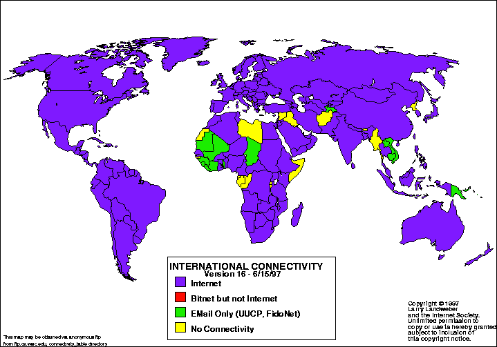
Searching for an interesting map, I found this internet connectivity map. This map was taken from the Atlas of Cyberspaces website. Larry Landweber, from the Computer Science Department of the University of Wisconsin - Madison, created the map to conduct a "census" of internet connectivity. Done in 1997, this particular map indicates: 1. which countries are connected to the internet, 2. which have bitnet, but not internet, 3. which have email only such as UUCP and FidoNet, and 4. which have no connectivity at all. Furthermore, the colors used were purple, red, green, and yellow. However, what was not included on this world map was Antarctica. Even though it is an inhabitable place for humans, it still would have been more complete if stated whether internet connectivity was possible there. Altogether, it contained interesting information.

To find an interesting map, I searched "statistical maps" and came across this particular one. Which countries don't have internet and which do intrigued me, because I never really thought about it and I always assumed that the internet was worldwide. Living in a country that does have internet connectivity is a luxury. From this map, I can assume that those countries that do not have full internet are the less developed nations in Africa and Asia; however, that requires further research. But in this particular case, the map was created in 1997. I wonder if the countries that didn't have internet connectivity back then, have it now in 2012.


Storms between 1900-2011
This map was taken from the Stamen Design website. This map's creator is not stated on the website; however, it is also an MSNBC Historical Map, which is interactive and is able to isolate particular storms that occurred between the years 1900-2011. This particular snapshot of the interactive map (taken from the Stamen Design website) depicts storms that had made landfall between the years mentioned. Two other options that are available are "no landfall" and "all storms" on the interactive map. Furthermore, the routes of the storms can be isolated and information such as the name of the storm can be seen. Based on its color from green to red, the storm's strength on the Saffir-Simpson Scale can be noted. From a single map, one can find various information on a single or many storms.

This map interested me because of the bright green, which are the paths of some of the storms. At first glance, it seemed like scribbles over North America and parts of the Atlantic Ocean. However, on further inspection, there is so much information on a single snapshot. The further I investigated this snapshot of the interactive map, my interest grew more and more. It is intriguing how many storms the US goes through in a matter of a hundred years. It surprised me how much information a single map can hold.


Sunken Kronprinz Wilhelm Battleship
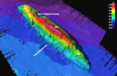
Searching ocean maps, I came across this particular one in Google images. This map was taken from a website about GIS Day, but the maker of this map was not mentioned on this website. It is part of the Ocean Mapping and Exploration Maps Collection of GIS Day back in 2006. So, this map depicts the depths of the ocean with various colors - with the cooler colors as the deepest in the ocean. The map also labels the parts of the battleship such as the engine room access, the keel, the forward mast structure, and the bow. The keel, which is labeled as the pink area, depicts the highest point of the boat. I assume that the edges colored black are the deepest points of the map and places where reading was not or could not be done. For ocean mapping, this particular map is interesting because it is not like a conventional map.

This map intrigued me because it differed in what I usually think maps are. It hadn't occurred to me that this is a type of map. Furthermore, I am curious as to what type of instrument can make these maps. I can only think of an instrument making some sort of wave through the water to determine the depth of the ship and the sea floor. However, I am not familiar with any of it. Also, I am curious as to why the ship is positioned in that way. Why is the ship sideways and not pointing downward? This map evoked questions about the type of instrument used and why the battleship is in the position it is in and that is why this map is interesting to me.