Monday, October 22, 2012
Assignment #3 - Neogeography
View Hospitals/ Clinics in a larger map
This map shows the location of various hospitals in some parts of the LA region. Located towards the more richer towns of Beverly Hills are various hospitals and specialized clinics. However, towards the more substandard areas to the south, there are less specialized hospitals and more space between the general hospitals.
Neogeography:
Neogeography allows people to create their own maps without much knowledge in GIS. It is a much more user-friendly. Also used in social networking, banking, and social events (such as games and flash mobs), neogeography gives the public an increased general awareness. This lets people know where something is virtually anywhere on earth at real time.
But this could also be a bad thing - privacy is no longer available to many people through neogeography. There are downfalls to neogeography. Furthermore, look at my neogeographical map above. I searched only for hospitals in certain places. I'm not entirely sure that those are the only hospitals and clinics south of Beverly Hills. The information on neogeographical maps may not always be true.
The general public has heightened expectations of what their technology can do. Instant updating of a person's location accurately is an expectation. If the technology states that that person is somewhere he or she is not, that expectation adds to the aggravation towards what technology should do.
However, GIS needs neogeography as much as neogeography needs GIS. Neogeography is user-centric, while GIS is map-centric. While GIS is accuracy driven and far more detailed, the uses of neogeography drive the improvement of GIS and neogeography needs GIS to run.
Tuesday, October 9, 2012
Assignment #2: USGS Topographic Maps
1. Beverly Hills Quadrangle
2. (1) Northwest: Canoga Park
(2) North: Van Nuys
(3) Northeast: Burbank
(4) West: Topanga
(5) East: Hollywood
(6) n/a
(7) South: Venice
(8) Southeast: Inglewood
3. 1966
4. North American Datum of 1927 (NAD 27) and the North American Datum of 1983 (NAD 83)
5. 1: 24 000
6. a) 1200 meters
b) 1.8939 miles
c) 2.64 inches
d) 12.5 centimeters
7. 20 feet
8. a) Public Affairs Building = 118°/ 23' N and 34°/ 04' E
decimal degrees: 118.383333°N and 34.066667°E
b) Tip of Santa Monica Pier = 118°/ 30' N and 34°/ 00' / 30" E
decimal degrees: 118.5°N and 34.008333°E
c) Upper Franklin Canyon Reservoir = 118°/ 24' / 30" N and 34°/ 07' E
decimal degrees:118.408333°N and 34.116667°E
9. a) Greystone Mansion = 560 to 580 feet ( meters)
b) Woodlawn Cemetery = 140 feet ( meters)
c) Crestwood Hills Park = 600 feet ( meters)
10. Zone 11
11. 3763N and 362E
12. 1 million meters squared
13. Elevation Profile

14. 13° 12'
15. South
16. Map of UCLA
Tuesday, October 2, 2012
Assignment #1: Interesting Maps
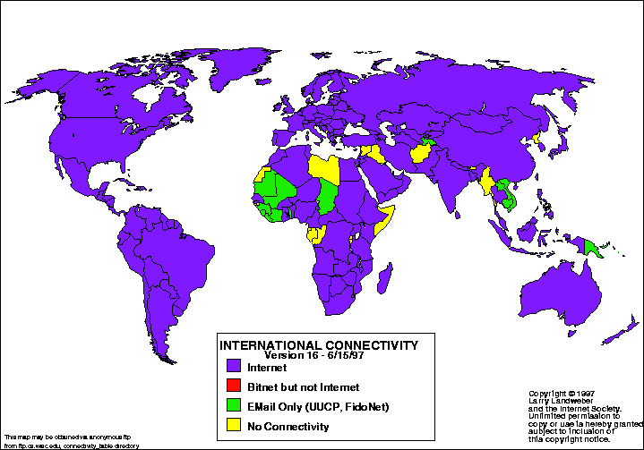 |
| International Connectivity |
Searching for an interesting map, I found this internet connectivity map. This map was taken from the Atlas of Cyberspaces website. Larry Landweber, from the Computer Science Department of the University of Wisconsin - Madison, created the map to conduct a "census" of internet connectivity. Done in 1997, this particular map indicates: 1. which countries are connected to the internet, 2. which have bitnet, but not internet, 3. which have email only such as UUCP and FidoNet, and 4. which have no connectivity at all. Furthermore, the colors used were purple, red, green, and yellow. However, what was not included on this world map was Antarctica. Even though it is an inhabitable place for humans, it still would have been more complete if stated whether internet connectivity was possible there. Altogether, it contained interesting information.
To find an interesting map, I searched "statistical maps" and came across this particular one. Which countries don't have internet and which do intrigued me, because I never really thought about it and I always assumed that the internet was worldwide. Living in a country that does have internet connectivity is a luxury. From this map, I can assume that those countries that do not have full internet are the less developed nations in Africa and Asia; however, that requires further research. But in this particular case, the map was created in 1997. I wonder if the countries that didn't have internet connectivity back then, have it now in 2012.
This map was taken from the Stamen Design website. This map's creator is not stated on the website; however, it is also an MSNBC Historical Map, which is interactive and is able to isolate particular storms that occurred between the years 1900-2011. This particular snapshot of the interactive map (taken from the Stamen Design website) depicts storms that had made landfall between the years mentioned. Two other options that are available are "no landfall" and "all storms" on the interactive map. Furthermore, the routes of the storms can be isolated and information such as the name of the storm can be seen. Based on its color from green to red, the storm's strength on the Saffir-Simpson Scale can be noted. From a single map, one can find various information on a single or many storms.
This map interested me because of the bright green, which are the paths of some of the storms. At first glance, it seemed like scribbles over North America and parts of the Atlantic Ocean. However, on further inspection, there is so much information on a single snapshot. The further I investigated this snapshot of the interactive map, my interest grew more and more. It is intriguing how many storms the US goes through in a matter of a hundred years. It surprised me how much information a single map can hold.
Searching ocean maps, I came across this particular one in Google images. This map was taken from a website about GIS Day, but the maker of this map was not mentioned on this website. It is part of the Ocean Mapping and Exploration Maps Collection of GIS Day back in 2006. So, this map depicts the depths of the ocean with various colors - with the cooler colors as the deepest in the ocean. The map also labels the parts of the battleship such as the engine room access, the keel, the forward mast structure, and the bow. The keel, which is labeled as the pink area, depicts the highest point of the boat. I assume that the edges colored black are the deepest points of the map and places where reading was not or could not be done. For ocean mapping, this particular map is interesting because it is not like a conventional map.
This map intrigued me because it differed in what I usually think maps are. It hadn't occurred to me that this is a type of map. Furthermore, I am curious as to what type of instrument can make these maps. I can only think of an instrument making some sort of wave through the water to determine the depth of the ship and the sea floor. However, I am not familiar with any of it. Also, I am curious as to why the ship is positioned in that way. Why is the ship sideways and not pointing downward? This map evoked questions about the type of instrument used and why the battleship is in the position it is in and that is why this map is interesting to me.
To find an interesting map, I searched "statistical maps" and came across this particular one. Which countries don't have internet and which do intrigued me, because I never really thought about it and I always assumed that the internet was worldwide. Living in a country that does have internet connectivity is a luxury. From this map, I can assume that those countries that do not have full internet are the less developed nations in Africa and Asia; however, that requires further research. But in this particular case, the map was created in 1997. I wonder if the countries that didn't have internet connectivity back then, have it now in 2012.
 |
| Storms between 1900-2011 |
This map interested me because of the bright green, which are the paths of some of the storms. At first glance, it seemed like scribbles over North America and parts of the Atlantic Ocean. However, on further inspection, there is so much information on a single snapshot. The further I investigated this snapshot of the interactive map, my interest grew more and more. It is intriguing how many storms the US goes through in a matter of a hundred years. It surprised me how much information a single map can hold.
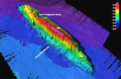 |
| Sunken Kronprinz Wilhelm Battleship |
This map intrigued me because it differed in what I usually think maps are. It hadn't occurred to me that this is a type of map. Furthermore, I am curious as to what type of instrument can make these maps. I can only think of an instrument making some sort of wave through the water to determine the depth of the ship and the sea floor. However, I am not familiar with any of it. Also, I am curious as to why the ship is positioned in that way. Why is the ship sideways and not pointing downward? This map evoked questions about the type of instrument used and why the battleship is in the position it is in and that is why this map is interesting to me.
Subscribe to:
Comments (Atom)